![[INTERVIEW] DreamWorks Visual Development Artist Priscilla Wong Talks ‘Trolls’](https://www.rotoscopers.com/wp-content/uploads/2017/02/2.jpg)
Priscilla Wong is a DreamWorks Animation visual development artist whose credits include such films as Mr. Peabody and Sherman, Penguins of Madagascar and most recently, Trolls. In celebration of the release of the Trolls: Party Edition on DVD and Blu-ray we got the opportunity to chat with Priscilla about her work on Trolls and the unique visual design of the film.
Rotoscopers: Let’s start off by talking a little bit about how you got involved with Trolls and some of the early development of the project in the art department.
Priscilla Wong: Sure. So I’ve been a long time fan of Kendal Cronkhite, my production designer, and when she asked me to join her on a quirky, girly, film about trolls I said yes! So I was brought on fairly early and one of my first assignments was to find the look of the scrapbook scenes which is Queen Poppy’s form of diary.
Rotoscopers: A major part of your work on the film was designing the scrapbook scenes, right?
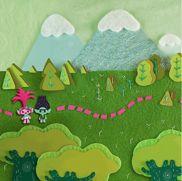
Priscilla Wong: Yeah, so I think Kendal put me on it because she recognized my love for decorative arts, I love fashion and I have an attention for detail. The thing we finally had our eureka moment on was a page in the scrapbook opening called ‘Happy Forest’ and basically it had the right mix of felt, paper, and unconventional material, much like the DNA of our film.
Rotoscopers: So can you dive a little deeper into how you went about creating these scenes? Was it traditional work or digital?
Priscilla Wong: So, I did all my planning digitally in Photoshop and I would just start with storyboards and all the digital planning would be figuring out camera movement. So, basically, the first question I would ask is, “how much do we have to build?” because the camera moves around a lot and pushes in the comedy, so often the scrapbook art is much bigger than what we see on screen. So, I’m planning out camera movement, I have to design the shapes. Like, there’s a page in the opening with Bergen Town and basically we had to build the entire town in scrapbook form and not only does it have to read, but it has to push in to the troll head on top of the cage and transition into 3D. So, it’s a lot of digital planning at first, but after that everything is hand made and really the challenge was how do we translate the essence of this moment into real materials? Because suddenly I’m limited to only what I can find and we needed a language for the two worlds.
So, for Troll Village, for example, I used glitter, more trims, and more delicate material because the trolls’ world was more precious, whereas in Bergentown I used cruder materials, lots of lumpy wool, clay, crusty sponges. We wanted the materials to reflect the two worlds and have that contrast in tone, yet feel cohesive in visual language because it has to feel as if Poppy made the whole thing.
Rotoscopers: As a visual development artist usually your work does not end up directly on screen, so how was it seeing your work come alive on the big screen?
Priscilla Wong: So at first, because it was such a new process to have hand made art on screen, I freaked out about every little detail because I’m a huge perfectionist and I didn’t want anyone to see my mistakes and it got to the point that Mike [Mitchell] and Walt [Dohrn] had to tell me to chill because it was about having fun and I think the final look turned out really well and I’m super happy with it. It feels fresh because they told me to relax. So, when you cut paper really fast sometimes the material gets stuck on scissors and then you get this raggedy edge, and I didn’t want any of that to show because I love fashion so much and everything that I like to look at on the runway is perfect so obviously my art has to be perfect [laughs]. But actually they wanted that stuff to show, because our characters are flawed and this movie is supposed to be funny and there’s value in showing warmth and personality in the art and maybe that comes with not being perfect.
Rotoscopers: The scrapbook scenes were some of my personal favorite scenes in the entire movie, but I was very impressed with the overall visual look and design of the film. I remember seeing the fabric Bergen foot in the very first teaser trailer and being amazed with how inventive and original that choice was, so can you talk a little about some of the challenges of creating and designing this world and the characters that inhabit it?
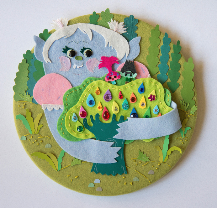
Priscilla Wong: So, I love that you pointed out that our entire world was based on fabric. That was totally our concept and it was based on the original troll dolls and how some of them have felted skin and how when you think of these dolls it’s all about the hair and all about color. So we found this fiber artist named Sayuri who built these amazing underwater worlds out of hand dyed fiber. So, we commissioned a sculpture from her, we commissioned her to do Troll Village and from that concept, from her art, we kind of decided our entire 3D world would me made out of felt. It’s a simple idea that I think has never been done in CG animation before so we’re super proud of it.
As for some of the challenges on this film, everything in Troll Village is rounded, there are no sharp edges and it’s always curve against curve and the reason for this is that we are trying to stay true to the original troll dolls and the same rules sort of apply to Bergen Town. Because we needed monsters, but they have to be friendly, so again, everything was rounded and maybe more lumpy, because we were looking at an artist named Philip Guston and he’s known for doing, I guess I’m going to call it ‘ugly cute’ art. He was an abstract expressionist in the ’70s and the Bergen Town is set in the ’70s with an medieval twist, so he was the perfect inspiration for that. Jeffrey Katzenberg, at the time, loved to call Bergen Town “poo-shaped,” it was kinda perfect for that world.
So, other than shapes one of the other challenges were scale. We had these tiny characters, so how do we make their world feel large, interesting, rich? We kinda had to think in macro lens for Troll Village, so all the insects are interesting, every plant has an interesting texture – maybe there’s a color ombre on how it transitions into the ground. What is the ground made of? Maybe it’s it has little flower appliqués stuck in it, and so we worked really hard to find this language to make this rich world. We were heavily referencing Scandinavian design because our troll dolls, the original dolls were Scandinavian, and so we wanted to be friendly. So we looked at Scandinavian colors – there’s a lot of blue, greens and oranges, yellows, really sophisticated color combinations. And getting that right was huge and getting the right amount of detail because if we have too much detail in an image, suddenly we lose the sense of scale. So, yeah, it’s all about balance I guess.
So when we got to scrapbooks this visual language it was more challenging and had to be distilled to the DNA of our look. Because everything was made with real materials, again, and any decision we made had to be exactly the right one.
Rotoscopers: Because the production design of this film is so unique and had never been done before in feature animation, did you ever worry about how this was going to turn out on screen?
Priscilla Wong: Yes, I did worry about how it would look. But again, Mike and Walt asked me to chill and I think once we got into the flow of that we had to translate it into animation – because at the beginning we weren’t sure if it was going to be hand built concept art and then maybe we would build it in 3D, animate, and light it through our pipeline and at some point – after we had our eureka moment they decided they loved the look of the handmade art style so much that it should just appear on screen that way. So, I worked with an After Effects animator named Eric Tillman, so after I would finish design and handle things, Eric would take over and animate all the characters and camera moves. So, it was really a two-man team.
Rotoscopers: To wrap it up, can you go a little into some of your inspirations for the design of the movie?
Priscilla Wong: It was mostly Danish. We really tried to stay as true as possible. So, for the pods, which are their houses, that was inspired by the shape of the troll hair. Because it makes this candlewick shape, and we thought, “Oh that’s perfect, why don’t we just [shape their houses like that],” and they’re just hanging from the forest for the canopy, like, wouldn’t that be beautiful and that they would illuminate from the inside. It gives us options for really pretty lightning scenarios and colors. And then all our plants that was inspired by Scandinavian and Danish design, so we would look at all the graphic textile designers from that time, of the ’70s, and make our 3D designs look, I guess as flat as possible in a playful way. Do you remember those flowers from the campfire sequence, when they’re all singing?
Rotoscopers: I do.
Priscilla Wong: Yeah, all those flowers, we tried to make them as Scandinavian as possible. So, a big central shape and the pedals are really big and we wanted to stay graphic and create a lot of patterns basically.
DREAMWORKS TROLLS IS AVAILABLE NOW ON DIGITAL HD AND BLU-RAY™ & DVD! Will you bring it home?
https://www.youtube.com/watch?v=UfBw0D7NG4I
Edited by: Hannah Wilkes
![[INTERVIEW] ‘Hugs’ Animator, Nicolas Fong (Sundance Animator Spotlight Series 2026 #6)](https://www.rotoscopers.com/wp-content/uploads/2026/02/Sundance-joder2-nicholas-animation-350x250.jpg)
![[INTERVIEW] ‘Busy Bodies’ Animator, Kate Renshaw-Lewis (Sundance Animator Spotlight Series 2026 #5)](https://www.rotoscopers.com/wp-content/uploads/2026/02/Sundance-kate-renshaw-350x250.jpg)
