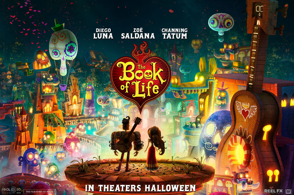
It’s been a few of days since the long-awaited The Book of Life trailer was released, and now that we’ve calmed down from all the excitement and digested its beauty, let’s talk about what we loved!

1) The Colors!
The very first thing most people have reacted to is the vibrancy of the choice in colors in The Book of Life trailer. Maybe it was because the movie is based around the Latin American holiday of the Day of the Dead (dia de los muertos), but most people seemed to think this film was going to be quite dreary, or perhaps a downer. But what is important to note is– this is NOT a Tim Burton film. Don’t get me wrong, I dig me some Burton, but what The Book of Life has built is nothing like the pre-established films revolving around the ideas of the afterworld and beyond. This is new and refreshing!
The colors take a direct influence from how the Day of the Dead is celebrated in Latin America: with lots of vibrant colors welcoming our passed loved ones home cheerfully. So, once we finally get to sit down in that theatre come October, expect to be wowed by unusually bright colors that will definitely have you saying “ooohhh” and “aaaahhh”.
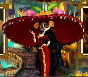
2) La Muerte
While having such a morbid title as “Death” (aka Grim Reaper), immediately dispenses images of long black robes and skeletal remains, La Muerte is not just an amazing re-imagining of the folkloric Catrina (more on that later). Yes, she is still skeletal in design but has a lavishly beautiful costume and, my favorite part, radiantly glittery skin! While some people may be confused as to why death should be depicted so beautifully, I think it stands to the core ideas of the film that there can be beauty in death: remembrance.
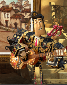
3) Character Design
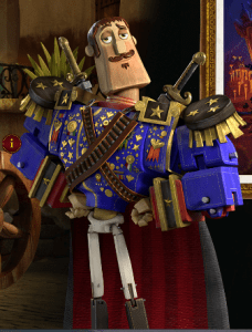
Thanks to the wonders of Pixar, the past few years in the animation world have had animators scrambling to make their visions much more realistic, which has been an incredible undertaking that has pushed animation to it’s limits. However, it is incredibly refreshing to see that the creators of The Book of Life have taken this departure from the current artistic tendencies set forth by the major studios.
This is most evident in the wooden/carved theme that is represented by the trio/main characters Manolo, Joaquin and Maria. There’s something to be said about how their being wooden carvings could be a representation of the fact that in their world, they are not necessarily in control of their destiny; they are marionettes in the eyes of the gods, or in this case, Death and her former lover.
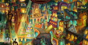
4) Scenery
By far, my most favorite thing about the trailer (and the website for that matter) is that we finally get to see the world these characters live in. From the moment the plot was described having to involve the afterworld, I’ve wondered what their take was going to be. And then when we found out it wasn’t just two worlds, I really started to scratch my head. And now that we have the images, I’m dying for more!
Two of my personal favorites have to be the engagement scene and directly from the website, “The Cave of Souls”.
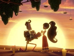
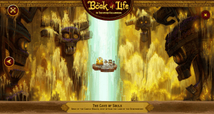
Their stunning use of color and light is beautifully romantic, in the thematic sense. Most interesting is that every visible choice behind the scenery has a meaning, for example in the town of San Angel, the houses sort of lean on each other for support, visually representing how the towns people also rely on each other in order to have a functioning community. Or in The Cave of Souls, the candles represents human lives, past, and present.


![[OPINION] 10 Heartwarming Animated Adverts to Watch This Holiday Season](https://www.rotoscopers.com/wp-content/uploads/2021/12/Picture61-350x250.jpg)


