Just a few more weeks until DreamWorks time-traveling adventure Mr. Peabody & Sherman will release in theatres. To tide you over until then, The Art of Mr. Peabody & Sherman by Jerry Beck, an inside look at the creation of DreamWorks’ newest animated feature, was released today. As someone who hasn’t seen the movie yet, reading this book and flipping through its pages made me even more excited to see the film than I already was.
The Art of Mr. Peabody & Sherman isn’t your typical animation art book; most art books have a big focus on the characters, but this one is a great mix of everything. The publishers used their space wisely and really managed to fill the pages with lots of interesting, relevant pieces.
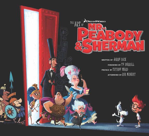
To start, I have to mention how much I love the book cover. Most art books have big and colorful covers, but this one is mostly black, featuring some of the new Peabody character designs walking through the door of the WABAC time machine on the front with the original cartoon Peabody designs walking into the WABAC door on the back. This movie is about time traveling so this clever cover simply illustrates that, showing us how the Peabody series has traveled through time from its origins in the 1960s to its revamp in 2014. Just like The Art of Frozen , this cover is something new, refreshing and worth examining before you even open the book.
Foreward & Preface
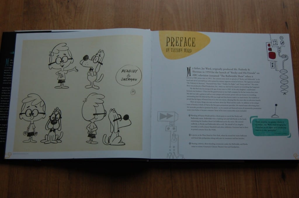
The foreword of this book is written by Ty Burrell (Modern Family) who voices Mr. Peabody in the movie. I really enjoyed reading this foreword because I loved reading about how proud Burrell was to be a part of this movie. While reading this section, my smile got bigger and bigger with each new sentence I read. The foreward is filled with jokes because Ty is naturally very funny. But we also get a lot of great information about Peabody in the original cartoon and ‘Ty’s version’ of Mr. Peabody.
The preface is written by Tiffany Ward, daughter of Jay Ward who created the original cartoons and she is also executive producer of this movie. Her preface was really interesting to read, especially for someone who isn’t familiar with the original cartoons. We are treated to a lot of great information about the original cartoons and her dad, as well as some sketches, stills and photos from the original series. I thought these two sections were great because Ty represented the new Peabody and Tiffany represented the original Peabody and heritage.
Introduction
Next up is the introduction. Like I mentioned before I wasn’t really familiar with the original cartoons, I knew the movie was based on cartoons from the 60s and I had seen some of them on YouTube but here is where we got a lot of insight about the history of the original cartoon and the history of this movie , which catches any Peabody newcomer up to speed. Reading this section made me really happy that Jerry Beck wrote this book, since he is a renowned animation historian and as a result knows a lot about the history of Mr. Peabody & Sherman.
A few pages further is the full colorscript of the movie in the form of a three-page pull out colorscript of the film’s three acts. Most colorscripts just feature concept art of the basic coloring of a scene, but this one also included actual completed stills from the movie. I can’t remember DreamWorks adding colorscripts in their other art books, so this is a great improvement. I didn’t take an extensive look at the colorscript since I haven’t seen the movie (and didn’t want to be spoiler), but the little glimpse that I did have looked amazingly detailed. It made me appreciate all the effort DreamWorks put in using color and light in this movie.
Main Characters
Like most art-of books, the first main section showcases the main characters, their designs and development iterations. There is quite a cast of characters in Mr. Peabody & Sherman, but this section focuses mostly on Mr. Peabody, Sherman, Penny and the Petersons.
To be honest, I didn’t expect this part of the book to be really interesting since these characters were already designed nearly 50 years ago. Since the characters are so classic and iconic, all DreamWorks really had to do was add some details and tweak designs to update the designs for more modern audiences. However, I really enjoyed these pages.
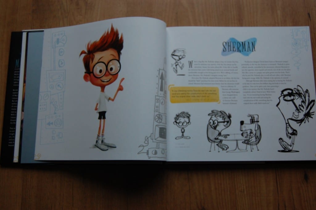
Each character section starts with this an entire page filled with a final character’s design by Tim Lamb. Most art books also have a CGI model of the character, but I’m glad DreamWorks didn’t do that because we all know what the final CGI characters look like. The Mr. Peabody page mainly featured character designs by Graig Kellman; the written information about the character was really informative as well and added a lot of great information about why certain decisions and changes were made to his design.
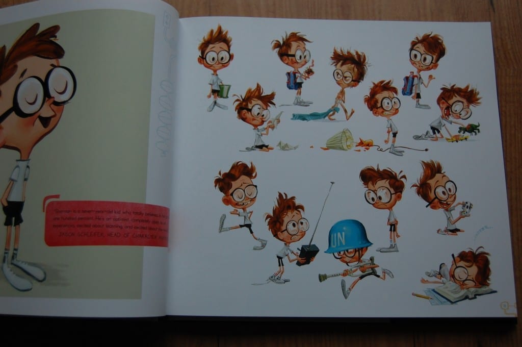
Sherman’s pages were identical to Peabody’s pages, most of the art were poses since this character was originally created over 50 years ago. The poses by Tim Lamb were interesting because they showed a lot of variation activities that Sherman, a typically young boy, would do: playing video games, playing with his toys, breaking a lamp, getting in trouble. I love this kind of art because it’s refreshing, fun to look at and really recognizable for 7-year old kids.
Likewise, Penny’s pages are great. Penny is a new character who wasn’t part of the original cartoon, so on her pages you can really see the development that was done for this character from start to finish. It seems the artists always had a rough idea of her in their heads of what she would look like, but they tried to flesh her out by playing around with different hair styles or other accessories. Even her personality seemed to change: at one point she was a nerdy character and the other times the popular girl. It’s great to see how much a character changes during production and DreamWorks showcased this perfect with Penny.
Peabody’s World
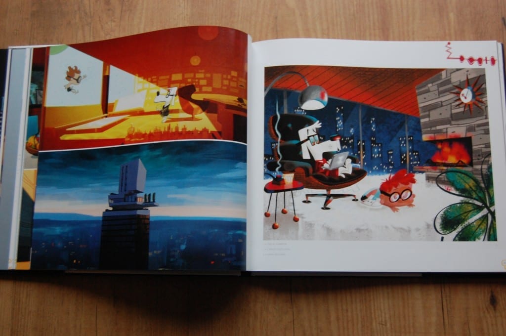
In the chapter ‘Peabody’s World’ we’re introduces to the world in which Mr. Peabody and Sherman live when they’re not time traveling. This chapter shows art from Peabody’s pad, Sherman’s room, Sherman’s school and characters, and of course the WABAC machine. I really liked this chapter, it gives us a look at a lot architecture, which is overwhelmingly breathtaking. Unfortunately this chapter doesn’t have a lot of text and behind-the-scenes information, but instead chooses to include a lot of full-page art spread over several pages instead of cramming as much as possible onto one page.
Mr. Peabody’s pad is really fun; it’s not realistic at all but it’s really cartoony and over the top. Much of the interiors pics are really detailed and each time you look at them, you’ll discover something new. Sherman’s school had less to offer art-wise, but it did include some costume design of Sherman’s classmates, teachers and principals. We also get a look at some hair designs for the students, which was another great addition to the book, further emphasizing that every little detail in an animated film needs be and is exhaustively designed.
The WABAC machine is the time-traveling machine Mr. Peabody invented to teach his son about history. In the original cartoon, Mr. Peabody and Sherman simply walked through a door and were transported to another time period. But for this movie, an actual machine was designed. It was fun to see the vast amount of designs and concepts made for the WABAC, many of which were ultimately scrapped and disgarded.
Peabody’s Travels
My favorite chapter of the book is ‘Peabody’s Travels’, I love history and this chapter features all the art of the historic locations and characters in the movie.
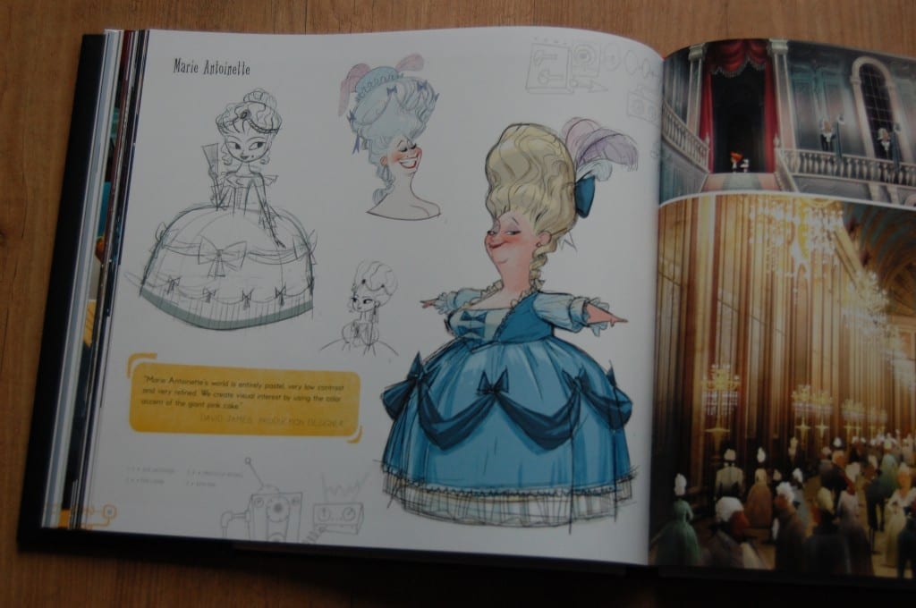
The first historic time period in the book is the French Revolution (a personal favorite). These pages are brimming with a lot of amazing art from these scenes in the film, yet I still wish there were some more pages. Yes, the characters end up visiting four time periods in the movie and yes if they included all the art this book would 500+ pages, but I just couldn’t get enough! Unfortunately Marie Antoinette, who’s the main character in this time period had only one-page page devoted to her, but at least we got to see an array of her designs. We also get some models of Marie Antoinette’s palace, including 3D models and designs of furniture, which were really spectacular to explore. This book does a great job highlighting all aspects of the film’s design and concept, instead of focusing on just the big things like characters and settings.
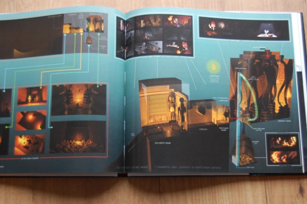
Next up is ancient Egypt. Just like the French revolution, we don’t get much about characters, but we do get to see into the development of the world and color exploration. There’s also a 3D model of the tomb setting, just like Marie Antoinette’s palace. This is a bird’s-eye view of the entire set, allowing you see it at a high level that you don’t see in the movie.
The next time period is renaissance Florence or the Leonardo DaVinci scene, just like the other pages these pages didn’t feature a lot of character development but some things I did love were ‘cartoon’ versions of Leonardo DaVinci’s paintings and a lot of made up inventions Leonardo made. A great addition to these pages were the amazing color keys, color and light is really important in this scene and these color keys make clear how amazing the light and color looks in this scene. We also get a loot at Troy where we see a much darker color palette than the other eras.
This chapter also features a gallery of historic figures, just like the color script this is a three-page pull out and it features historic characters who didn’t make it into the final film or who aren’t as important in the movie as the Mona Lisa or Cleopatra. There’s also a similar section which explored settings that didn’t make it into the final film. I’m glad this is in here because this is what I love about these books: we get a true look behind the scenes.
Building a Scene
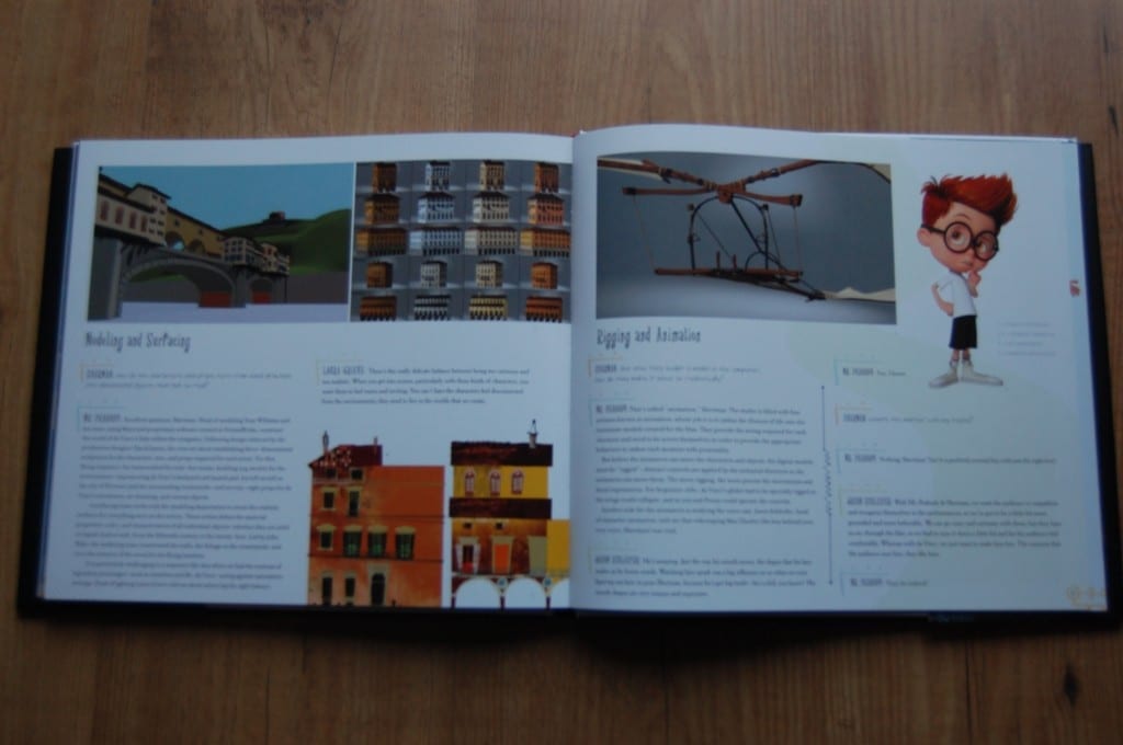
The final section is a chapter that almost every DreamWorks art book includes, a chapter about the technology behind these movies. In this case, we get a step-by-step breakdown of the different parts of building a scene from storyboards to the visual effects. This book did it differently in that it plays out like it’s a script for a special feature on the DVD; you have Sherman asking a question about this process and you have Mr. Peabody explaining it. While reading this I had Max Charles’ and Ty Burrell’s voices in my head and it was very informative at the same time, I learned a lot about the process and the added images helped a lot as well.
Conclusion
You might have noticed this has been a pretty big review. The only reason I have for that is that this book is really good! I wanted to talk about everything. I absolutely love this book and I enjoyed reading it. The art is stunning and I learned a lot about the original Peabody cartoon and about the new movie as well. The building a scene chapter was a particular high point for the book. Overall I think this is one of the best art books in my collection.
★★★★★
Purchase
The Art of Mr. Peabody & Sherman by Jerry Beck
YouTube Review
[youtube=http://www.youtube.com/watch?v=tDhmqahInD4]


