Alright, we know. Our old logo was pretty pathetic. Morgan whipped it together as a placeholder, intending to revise it once once the initial pilot episode was released.
Well, that never happened. Oops. So here we are, nearly a year later, and we are excited to unveil our new logo for the Animation Addicts Podcast with The Rotoscopers! Drumroll please….
Ta-da! We wanted something that gave the overall impression of animation. We also didn’t want to make it seem like we were a strictly Disney podcast (even though we love ourselves a good Disney animation movie), but wanted to include other important studios such as Pixar, DreamWorks, etc.
We feel that this album art does the trick! The silhouettes of classic animation film characters boldly and succinctly let browsers (or iTunes window shoppers) know what the show is about. Before, not so much. The font, while not directly taken from any animation studio or logo (that we know of), gives the impression of animation during its Golden Age. And, of course, you can’t forget to have The Rotoscopers’ (well, maybe just Morgan’s) favorite color, teal, in the design.
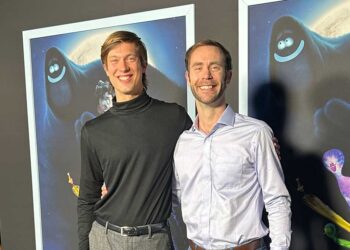
We want to give a big shout out and thank you to the logo’s designer, Naybeth Díaz. She is a graphic designer from Columbia and happily volunteered her services to help us out. We really can’t thank her enough because the new logo is beautiful, better than anything we could have imagined, and looks a thousand times more professional that what we had. Hopefully it gives us street cred in the animation community. 😉
If you’re interested in hiring Naybeth for design work, send her an email. You can also check out some of her other work on her tumblr and flickr accounts.